
Ticker Tape Parade
It’s good to be a little ‘river’ of thoughts—apart from the estuaries.
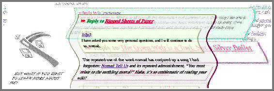
Inspired by the concept of Ripped Sheets of Paper, I began to see a new blog design in my mind that departed from all the current trends. (Related: Things We Left in the Old Web.)
The large majority of blogs and social media feeds out there are:
- Highly rigid visually—a linear list of paragraphs.
- Mostly blue and white (with a little gray.)
- Bland. Often all posts are structured virtually the same, unless there are images.
- Alike. There are common templates.
So, yeah, no wonder the Web has deteriorated! We just don’t care. It’s understandable—we experimented for a good ten or twenty years. I guess that’s why I wanted this site to border on bizarre—to try to reach for the other extreme without simply aspiring to brutalism.
To show that leaving social media can free you to build your own special place on the web. I have no reason to scream and war here in order to stand apart.
Exaggerated Importance
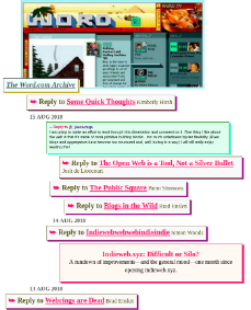
When I started laying out the main ‘river’ of strips on my various feed pages—here’s my August archive, for instance—I started to want the different posts to have a greater impact on the page based on what they were.

A tweet-style note thing should be tiny. It’s a mere thought.
A reply to someone might be longer, depending on the quality of the ideas within it.
And the long essays take a great length of time to craft—they should have the marquee.
It began to remind me of the aging ‘tag cloud’. Except that I couldn’t stand tag clouds because the small text in the cloud was always too small! And they also became stale—they always use the same layout. (It would be interesting to rethink the tag cloud—maybe with this ‘river’ in mind!)
It’s All There
Even though these ‘river’-style feeds are slender and light on metadata—for instance, the ‘river’ is very light on date and tagging info—it’s all there. All the metadata and post content is in the HTML. This is so that I can pop up the full post immediately. But also: that stuff is the microformats!
Why bother with microformats? I remember this technology coming out like a decade ago and—it went nowhere!
But, no, they are actually coming into stride. They allow me to syndicate and reply on micro.blog without leaving my site. I can reply to all my webfriends in like fashion. They have added a lot to blogging in these times—look up ‘Indieweb’.
Honestly, they make this blog worth using. For me. I feel like the design should be for you; the semantic structure is for me.
This lead to a happy coalescing of the design and the structure: I could load individual posts on a windowing layer over the home page. This is a kickback to the old DHTML windowing sites of yesteryear. (And, in part, inspired by the zine at whimsy.space.)

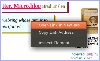
What’s more—nothing (except the archives dropdown, I should say) is broken if Javascript is off. You can still center-click on the square blog post cards to launch them in a tab. URLs in the browser should line up properly without filling your history with crap.
I do have some new kinds of post layouts that will be cropping up here are there—such as how this article is made of individual tiles. But it all flattens to simple HTML where I need it to.
One of the struggles of the modern Indieweb is to have uniqueness and flair without sacrificing function. I have to do a lot of customization to integrate with Twitter, micro.blog and RSS. But I hope you will not need to work around me. So that remains to be seen.
At any rate: thankyou! So many of you that I correspond with offered juicy
conversations that stimulated this new design. My muse has always been Life
Itself. The experiences and conversations all around --> inspiration!
I feel fortunate to any eyes that wipe across my sentences from time to time.
Time to get back to linking to you.


