HrefHunt!
UPDATED, 18 Apr 2019. I’m summarizing recent findings of various blogs and websites, many culled from reviewing threads like this one on HN. If you’re reading this and you have a personal blog that I don’t know about it, just send me a message, though—no need to wait until a certain time.
-
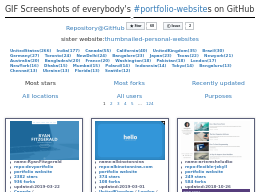
Umihico’s #portfolio-websites 124 pages of personal websites. Need to now look through all of these! (By umihico.)
-
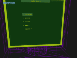
Shane Lessa Damn, this is hot. This goes right along with whimsy.space and i1os.com. I love how awkward the mouse is. This needs synth music.
-
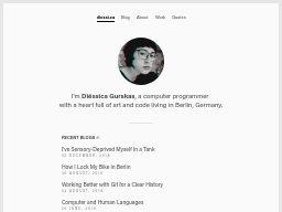
Diéssica Gurskas I really got sucked into this blog. Diéssica is cool—I need to come back to this.
-
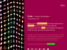
Yu Pretty. I like it. (Click on ‘Work’.)
-
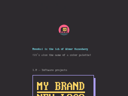
Monokai Here we go—a very lovely and clean take on ANSI coloring and shading. I’m amazed that Wimer has pulled off slanting the text without annoying the hell out of me. On the contrary, this is sweet! The dithering scroll effect is so well done; gives me the pringles when I watch it.
-
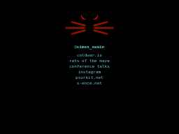
Simon Swain Minimalist sim and audio projects. Rats of the Maze is great!
-
Young Coder Matthew commented here and mentioned this Medium blog he runs on coding for kids. Elementary education is a big topic for me, so I am happy to follow his blog. It’s a privilege—thanks for saying hi, Matthew!

-
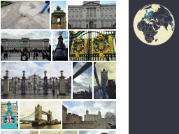
Odyssey Slick personal photoblog—written in the fairly obscure Elm language.
-
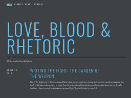
Love, Blood & Rhetoric Interesting blog by a writer of novels and plays—has a series of posts on writing a sword fight scene.
-
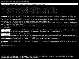
[email protected]:~# Not an actual prompt—just an illusion.
-
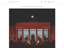
Pravendra Singh People love minimalist blogs/sites right now and this is one of the better ones. The blog is well done—lots of visualizations and good work done on animations.
-
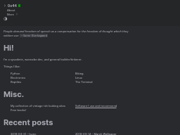
0x44.pw Another minimalist homepage. This could almost be a TiddlyWiki. Nice fonts.
-
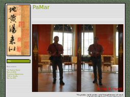
Paolo Marino Another wiki-like page. It’s very hidden though—it’s all in the left-hand menu. (Green ‘main’ box.)
-
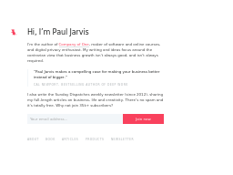
Paul Jarvis Nice colors, neat effect. More of a portfolio than just a personal website—again, could be a neat shell for a wiki.
-
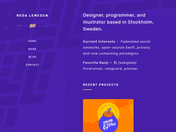
Reda Lemeden Love to see colorful, vibrant pages like this. Nice touches like the ‘favorite kanji’ mentioned on the home page.
-
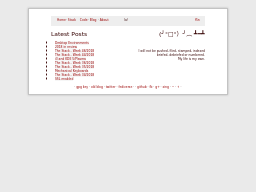
f5n Home page and blog hailing from 2011. Has been doing weekly link roundups (called The Stack) since that time—and Roundups are my theme this month!
-
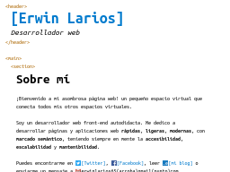
Erwin Larios A lot of sites preserve the Markdown characters in their output—this reveals some HTML tags inline. (See also: cyrilniobe.com.)
-
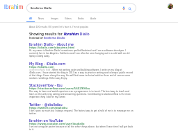
Ibrahim Diallo Hah, wow—this is pretty surreal. It’s hard to believe it’s not just redirecting to Google. If you browse the site: it’s a great ripoff.
-
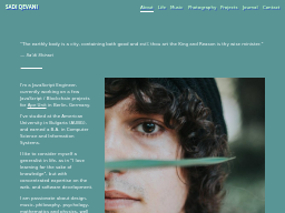
Sadi Qevani The whole vibe of this site is 90’s slideshow fades. The cyan color is straight-up Windows 95. Unusual—not just another vaporwave rip.
-
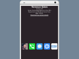
Terence Eden Since I collect websites that are patterned after desktop operating systems and outdated menuing systems—this is a rudimentary version of that for a mobile device. I would be interested to see this taken to stylized extremes. (See also: billpg.com.)
-
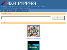
Pixel Poppers To some degree, I’m starting to collect gaming blogs—because I think that community has survived on blogs more than others. But I also like that this one covers the topic of ‘difficulty’, which is very important to me as a teacher.
-
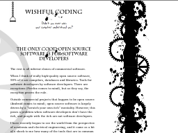
Wishful Coding Personal electronics, music, emulation projects. Even though you may not have a use for some of the specific code or advice given, this is definitely a portal to lots of other interesting topics and folks out there.
-
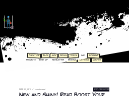
Barbarian Meets Coding The comic book header on this site is great. But I think what’s interesting is that this author has fit a blog, a ‘now’ page, a wiki, project pages—lots of things—within the same design.
-
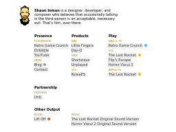
Shaun Inman Single-view personal home page. Understated, seems like a good starting place if you want to do a home page that’s like a portal to your other things.
Href Hunt Archives
-
January 2020: Just random personal pages - 24 of them I came across.
-
November 2019: 22 personal and pro sites from linked lists on the blogs I follow.
-
May 2019: 15 personal sites from Twitter etc.
-
April 2019: 24 personal sites from Hacker News. Four or five wild designs. One Google parody that’s quite good.
-
February 2019: 15 neat personal sites, plucked from HN and Twitter.
-
November 2018: A few sites from tweets and Pinboard. 10 blogs and web pages.
-
September 2018: Plundering graphic design forums and Reddit. 19 home pages and portfolios.
-
August 2018: A whole lot of stuff from Hacker News. 59 home pages and blogs.
-
July 2018: The first attempt. 1 home page, 1 podcast and 11 blogs.
